The Brief
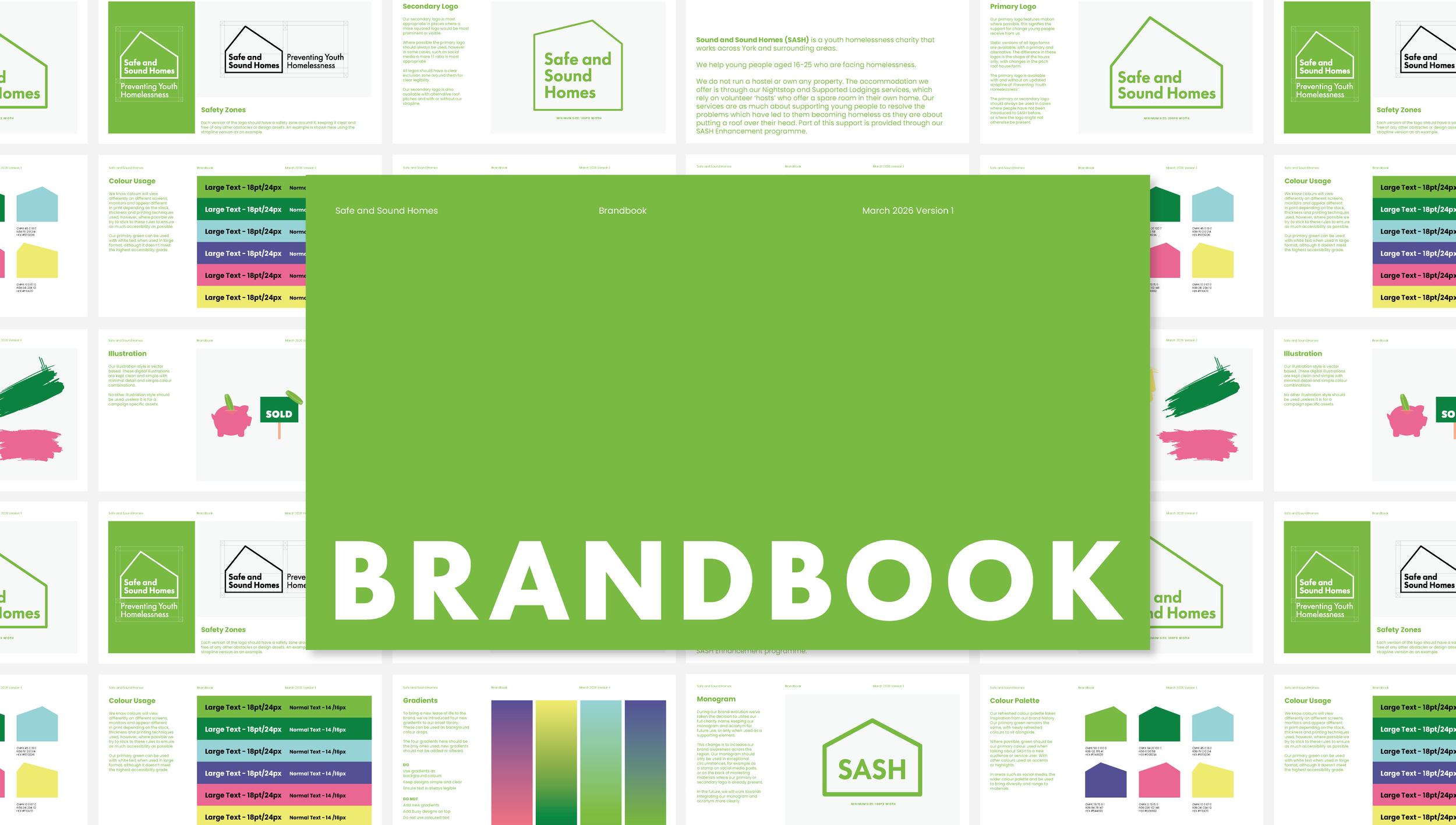
2026 marked 30 years of Safe and Sound Homes (SASH), the team instructed us to bring a fresh lease of life to the brand, while still paying homage to the existing brand. and its legacy.
The Process
Through workshops with senior leaders, trustees and service users, we identified foundational assets within the existing brand that people felt connected to. These assets built the foundation of the refreshed brand, and we got to work.
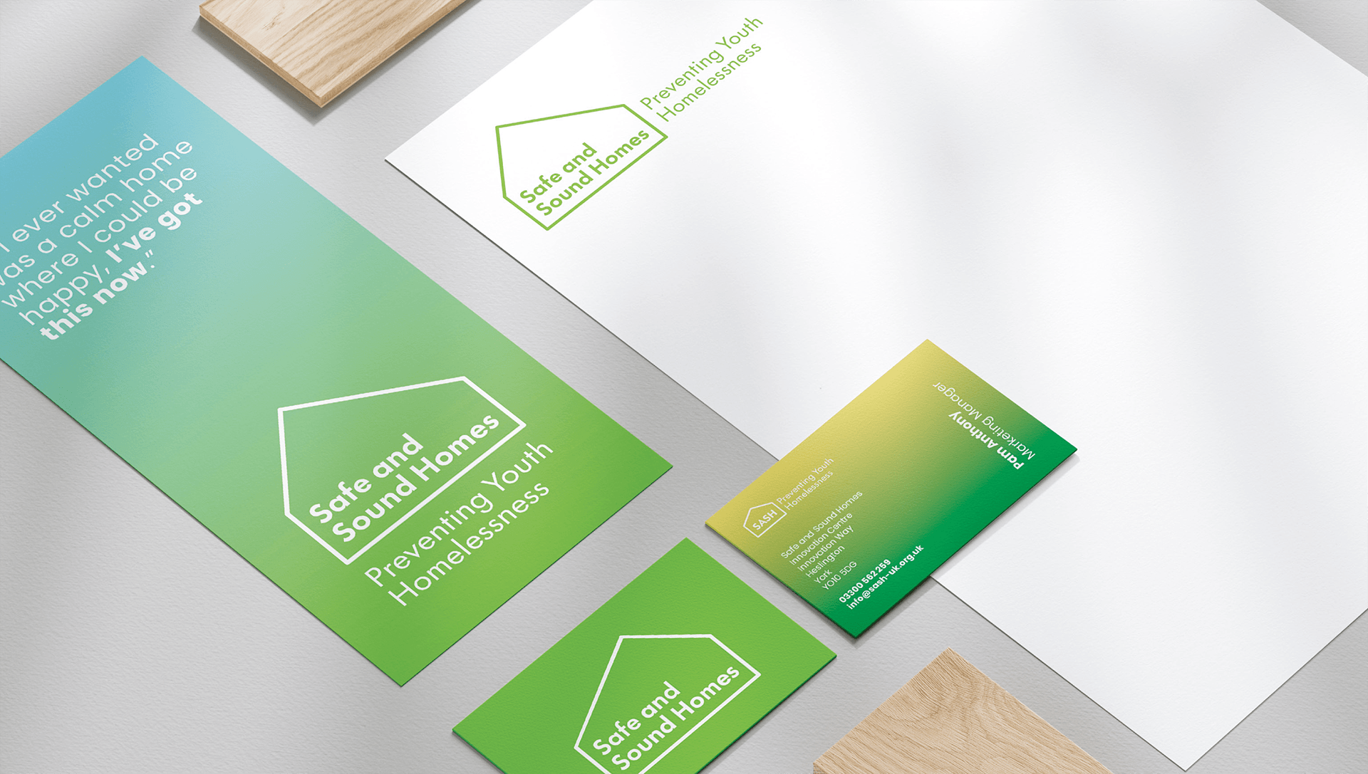
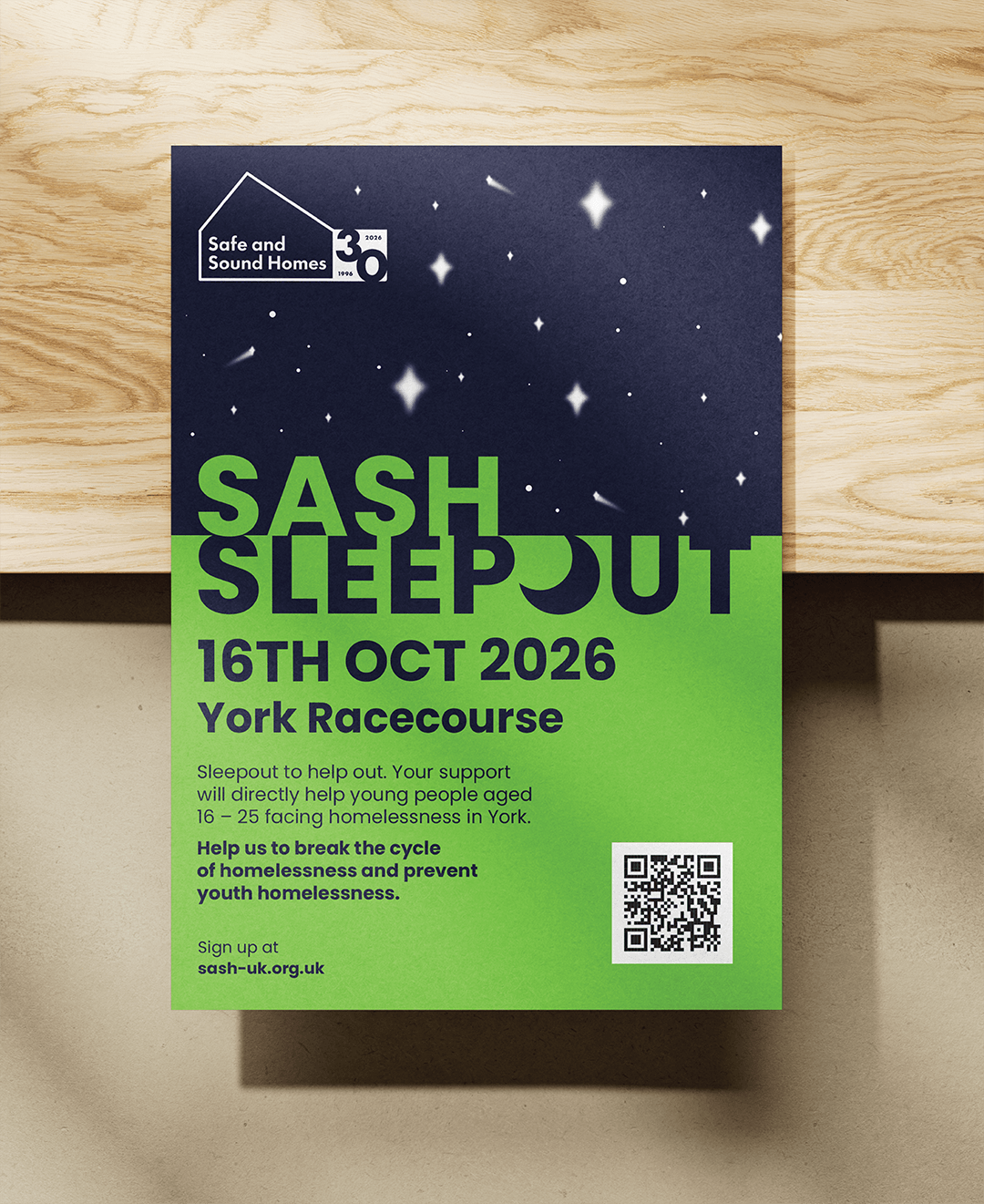
Before sign-off, it was vital that we tested the brand, once again with staff, trustees and service users. In our second workshop we presented a range of materials that people would be used to seeing, but redesigned in the refreshed brand and we invited people to give feedback.
The Results
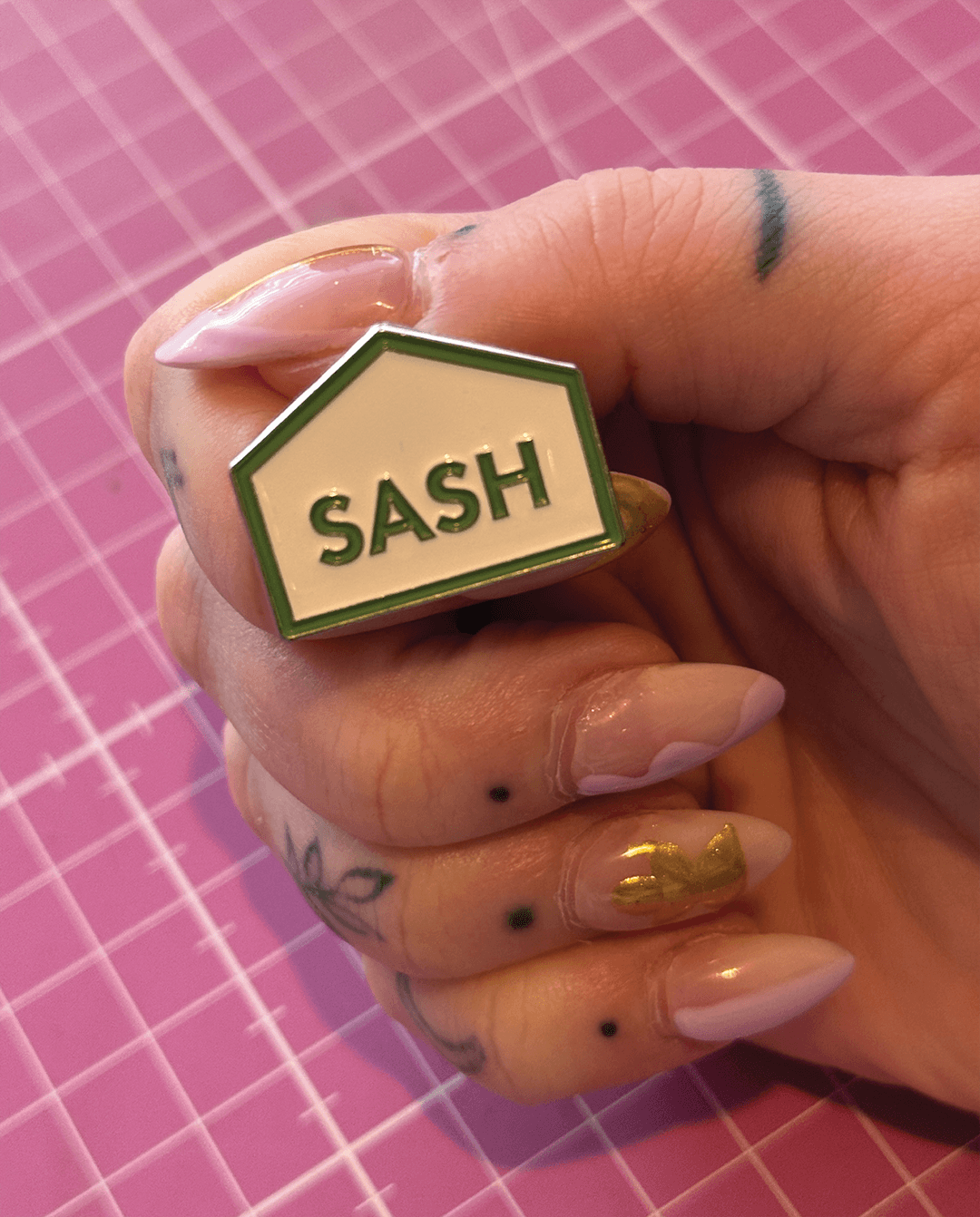
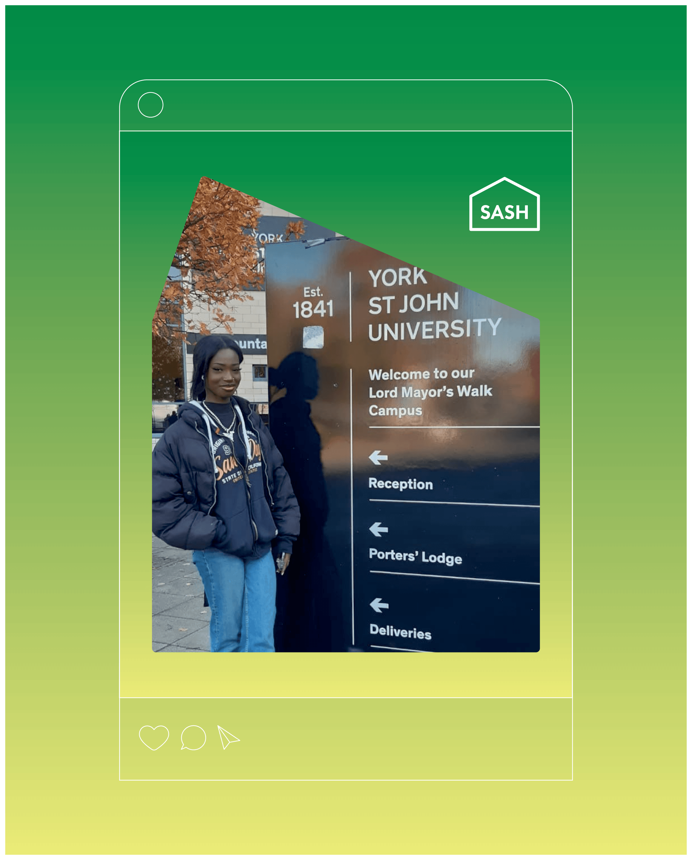
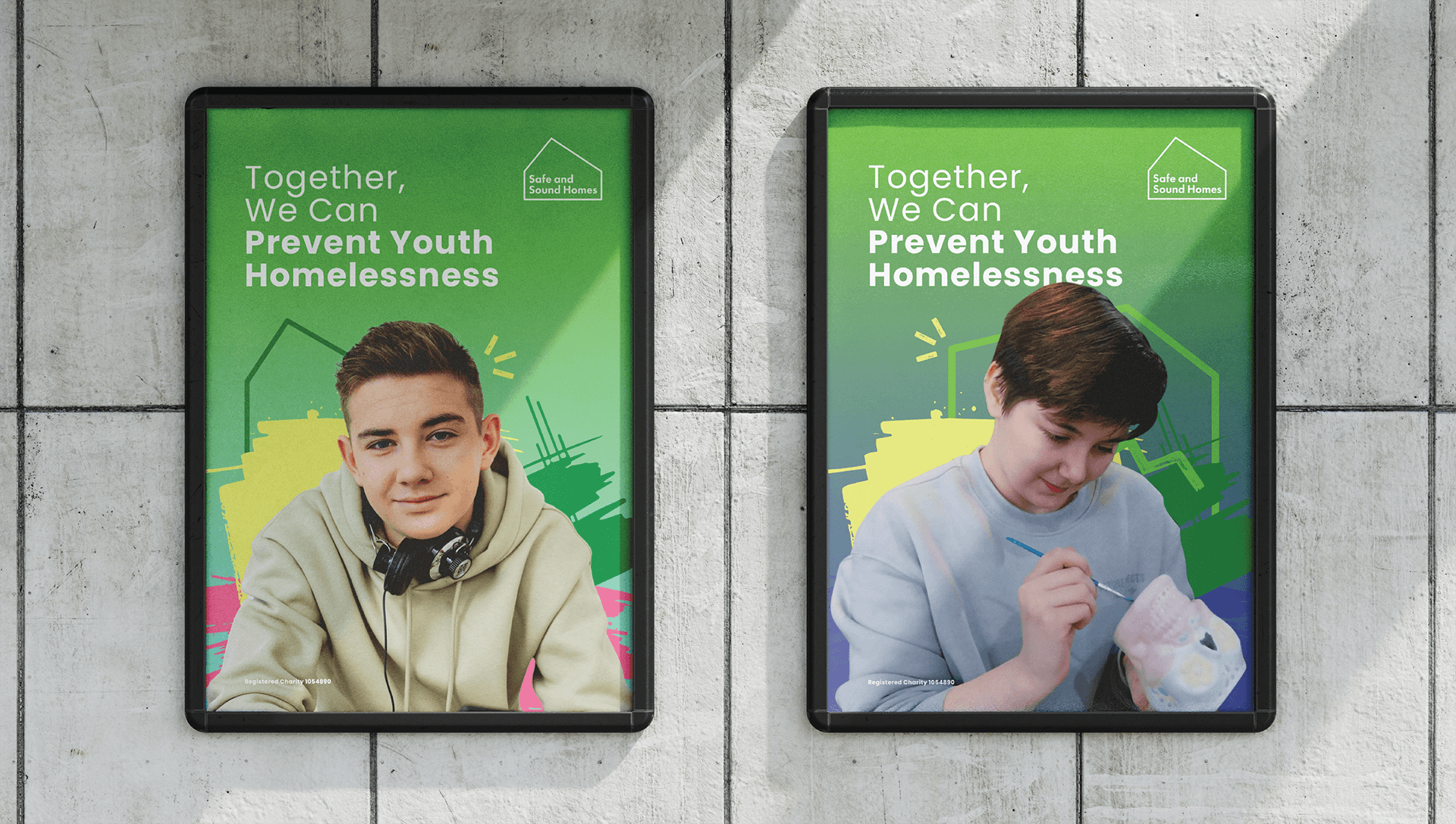
A new suite of logos, each showcasing a different shape to represent the fact homes come in all shapes and sizes, and no ones experience is the same, helps tell the story of SASH and service users.
The refreshed brand keeps the foundational elements of the iconic SASH green, paired with new, modernised and simplified elements for a more refined brand. Through training and detailed templates we created a brand the team can roll out confidently as they go into their 30th year of service.